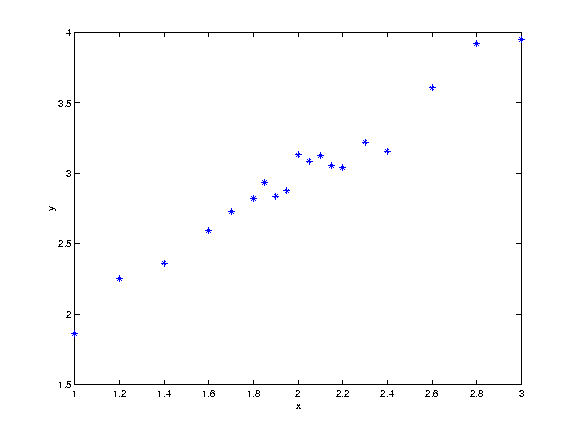
| x | 1.00 | 1.20 | 1.40 | 1.60 | 1.70 | 1.80 | 1.85 | 1.90 | 1.95 | 2.00 | 2.05 | 2.10 | 2.15 | 2.20 | 2.30 | 2.40 | 2.60 | 2.80 | 3.00 |
|---|---|---|---|---|---|---|---|---|---|---|---|---|---|---|---|---|---|---|---|
| y | 1.86 | 2.25 | 2.36 | 2.59 | 2.73 | 2.82 | 2.93 | 2.84 | 2.88 | 3.13 | 3.09 | 3.12 | 3.05 | 3.04 | 3.22 | 3.16 | 3.61 | 3.92 | 3.95 |
When given a dataset, it is often very helpful to plot the data. This gives a quick overview of the dataset, and makes it much easier to examine the data than just looking at the numbers themselves. In the figure below, a dataset in plotted with y on the abscissa and x on the ordinate.
From just looking at the plot, one can tell that there is some kind of relationship between x and y. The value of y seems to increase with the value of x. The purpose of the least squares regression is to establish a model that express this relationship between x and y. The first step in making this model could be to mean-center both the x- and y-values.

